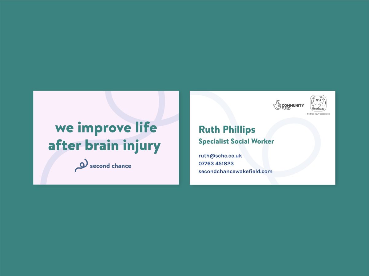
Second Chance
Working with people with brain injury to rebrand their centre
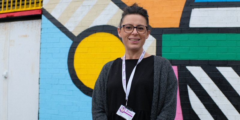
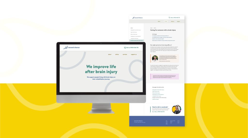
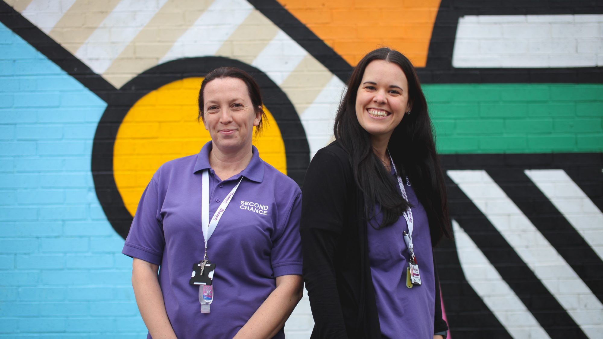
Second Chance is a member-led brain injury rehabilitation centre in Wakefield. Run by expert medical and rehabilitation staff, it works with care and compassion to support people on their rehabilitation journey and provides a warm and welcoming community where members can be themselves. We worked closely with members to rebrand the organisation and deliver a brand new website.
Branding & website
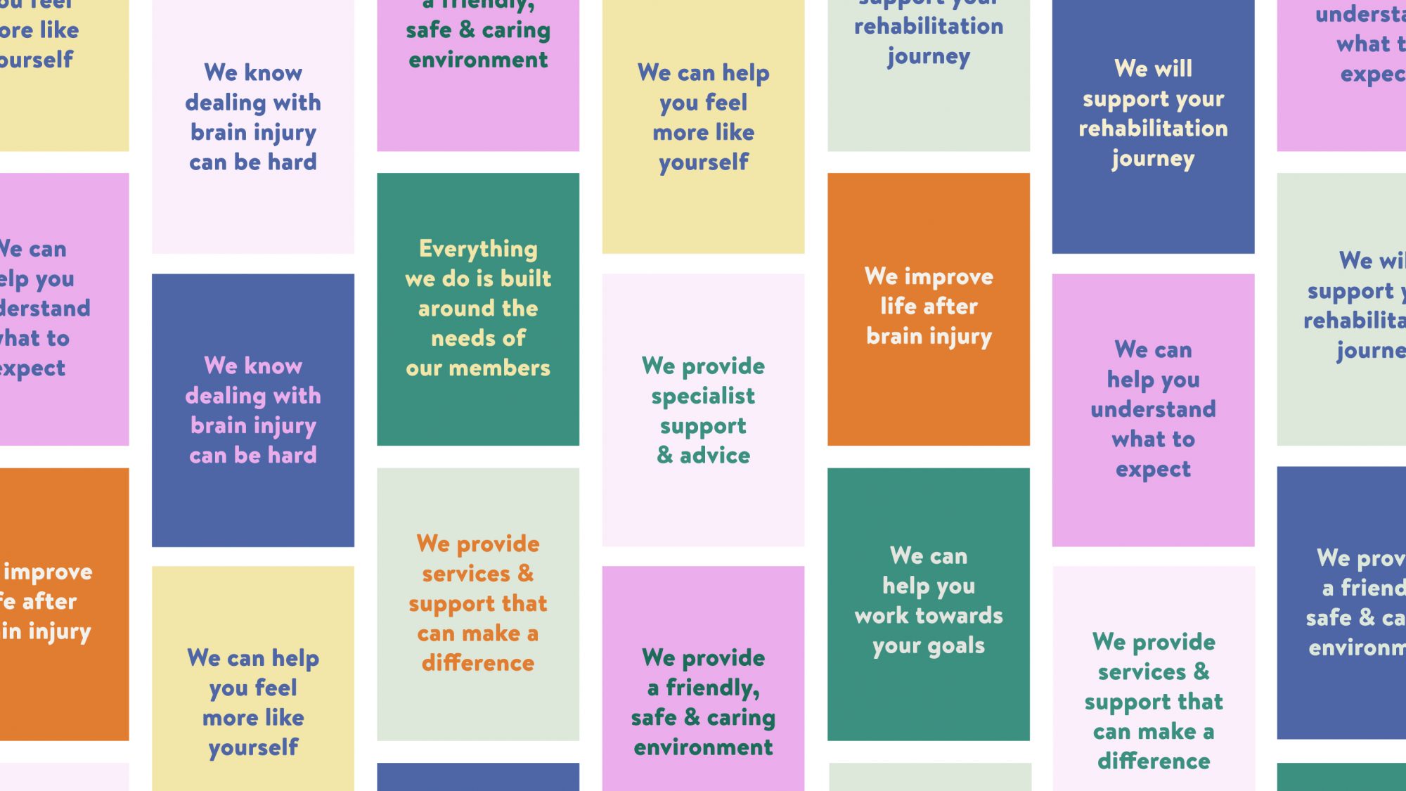
Involving members from the very beginning
We met with Second Chance members over a series of meetings to understand the role the organisation played in their lives. We involved as many people as possible in the design process at every step, listening to their thoughts and presenting our ideas back to them. The resulting brand is not only clear and coherent, but also something members feel reassured by – we unearthed an identity members always felt was there but which wasn’t being articulated.
I’d been trying in vain to get my head around everything but reading your advice pages was the first time I’ve found something where it all made sense!
– Second Chance member
Clear, straightforward copy for users with brain injury
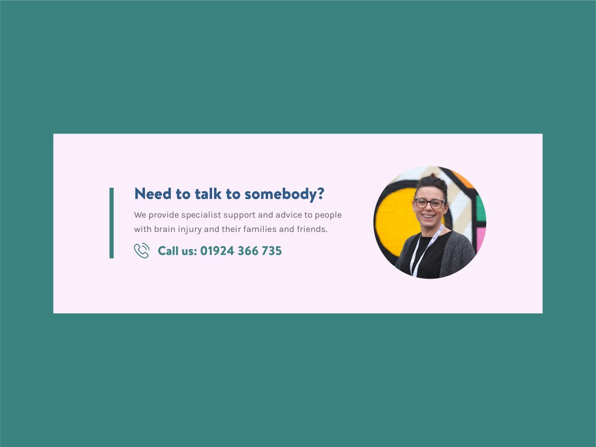
We worked closely with the organisation to develop a comprehensive help and advice section populated with useful information, created to educate people on the potential steps of the rehabilitation journey. We tested these pages with members to ensure they were suitable in terms of both tone and readability. When writing for audiences with impaired cognition, we made sure to follow best practice guidelines, such as front-loading sentences with key information.
An accessible design, suitable for everyone
We discussed accessibility throughout the design process, building up an understanding of small but significant ways in which brain injury accessibility needs are unique. For example, we learned that although most accessibility guides encourage high contrast ratios for text to aid readability, for people with brain injury (as well as some other neuro-atypical conditions), too high a contrast ratio can be equally problematic, with soft background colours preferred to harsh white.