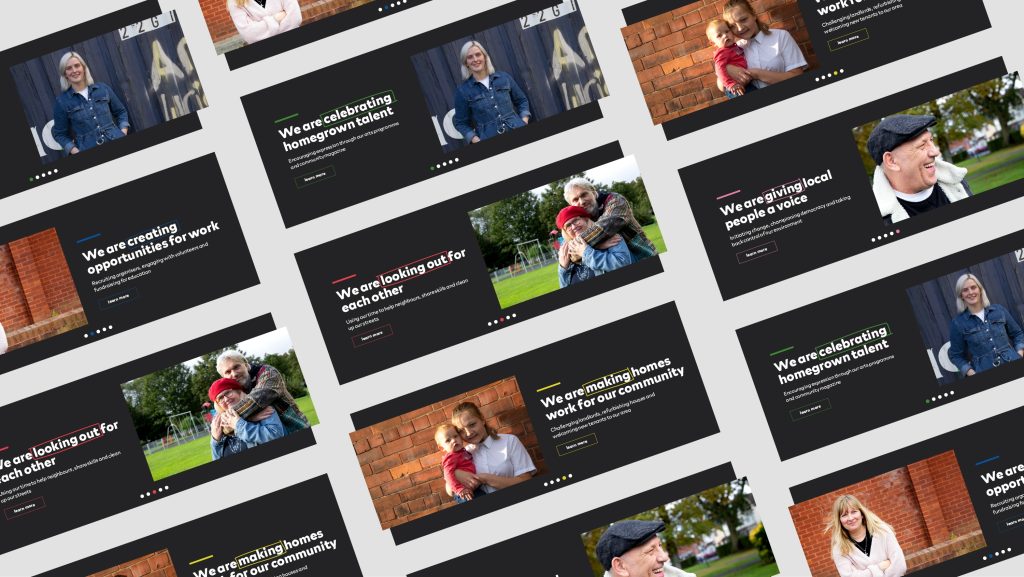
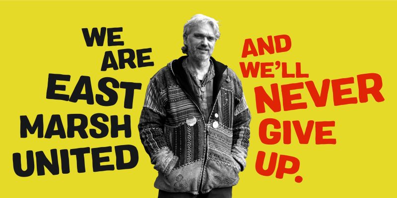
East Marsh United
The so-called ‘sink estate’ that wants to become a village
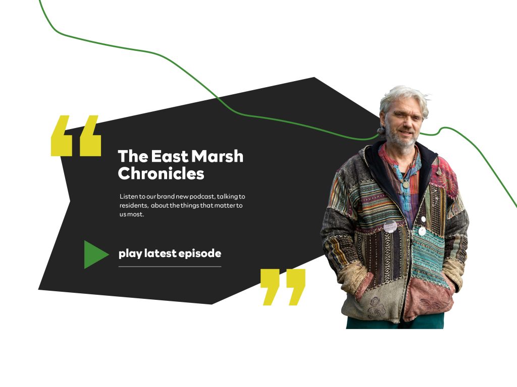
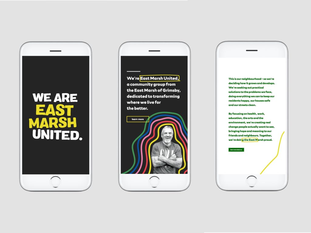
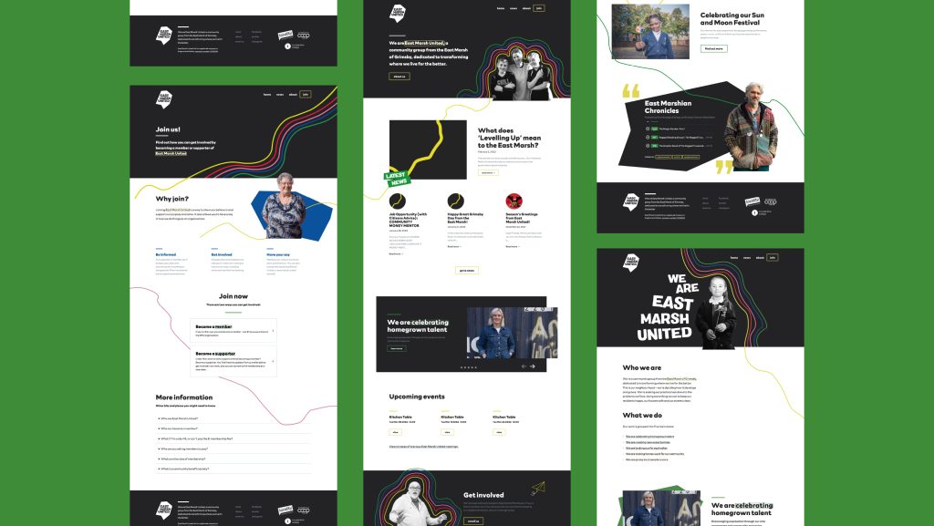
East Marsh United aren’t your average community group. They’re rolling up their sleeves and getting stuck in to make their local area – one of the most economically deprived in the UK – a place people can be proud to be from. We’ve worked with them to develop a brand identity and website that reflects their determinedness and their pride.
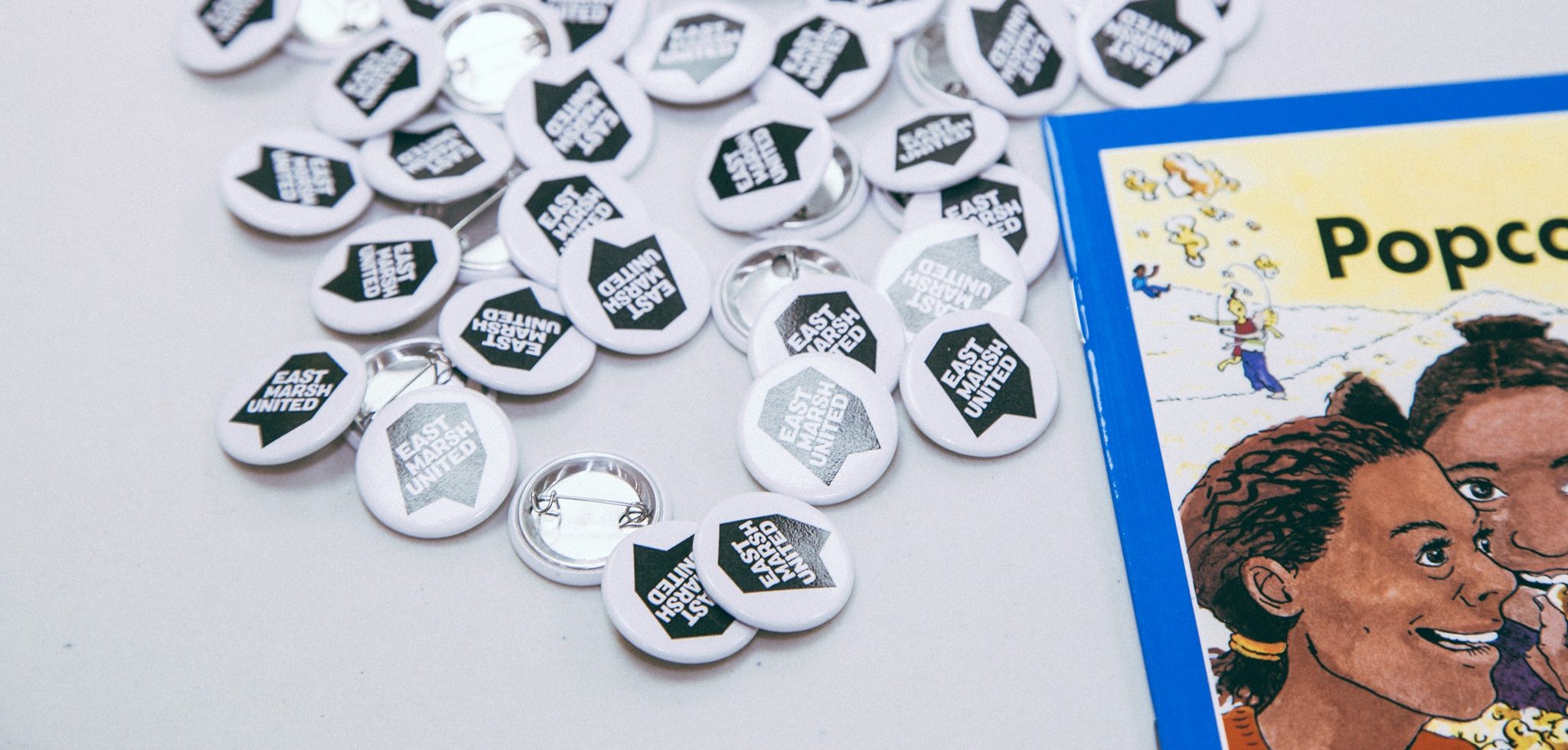
Branding, website, video and animation
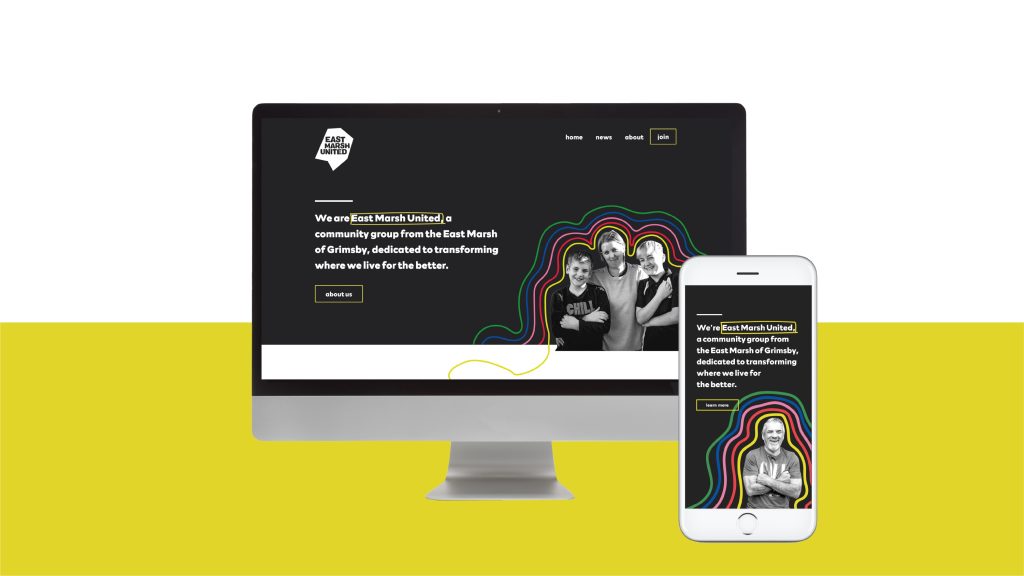
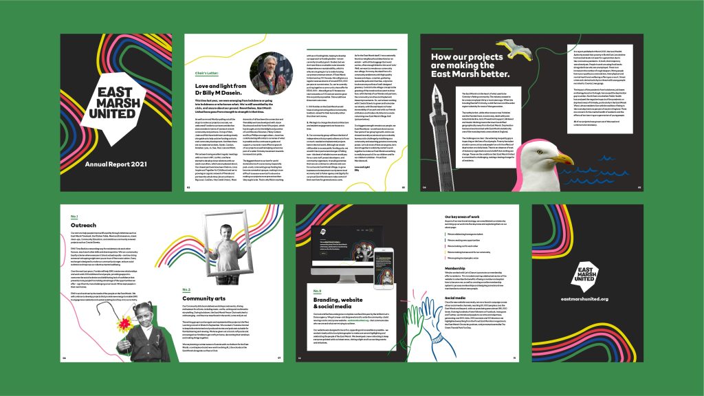
We created an aesthetic that balances the reality of local life with the belief that things can get better
How we put it together:
- A non-conformist look reflecting the spirit of the East Marsh and East Marsh United
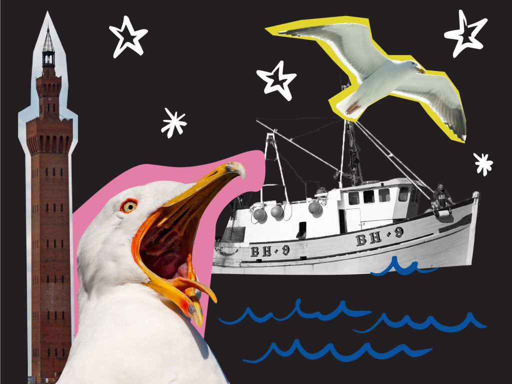
- Layering, contrast and playful irregularity hint at the disruptive nature and proactive attitude of the group, with a DIY aesthetic that reflects the way that East Marsh United are taking things into their own hands
- Positive colours create optimism and a feeling of positivity and action
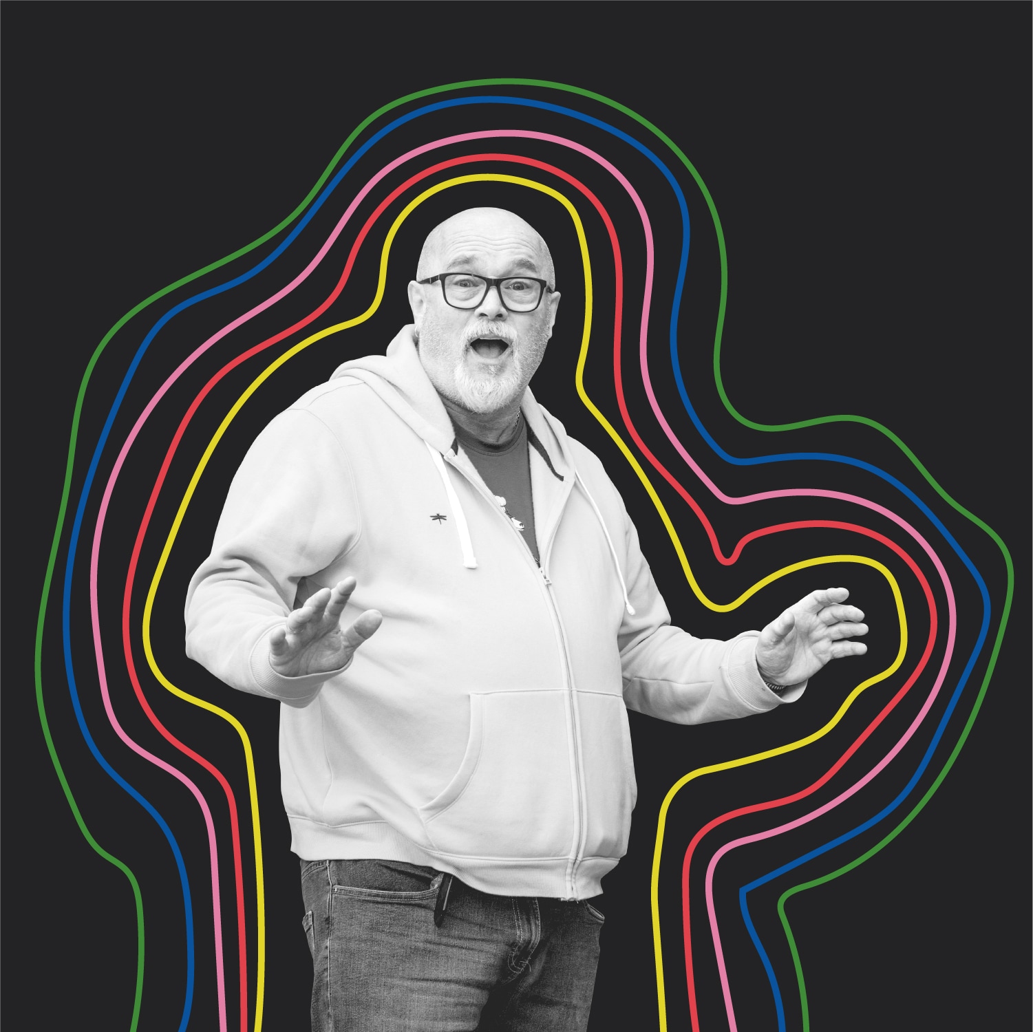
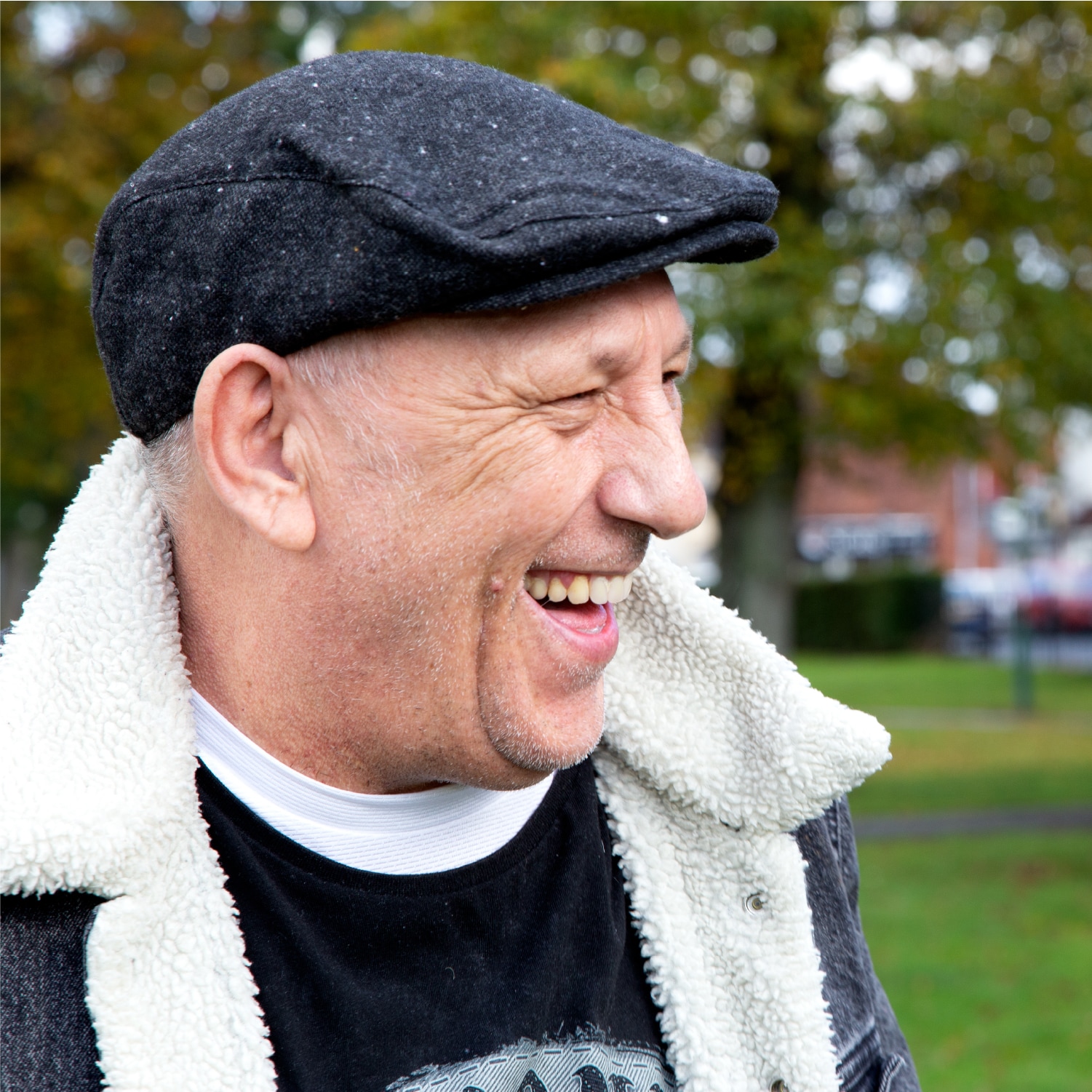
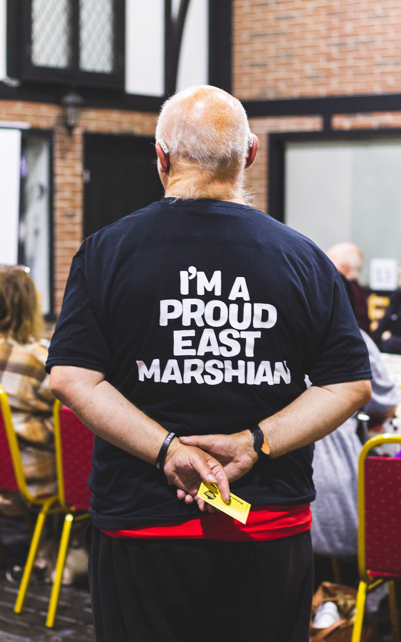
- Photos of actual members of the community and the local area inspire trust and relatability, while overlaid bright illustration contrasts before and after
